ElementPad Design System – From 0→1
Abstract
ElementPad is an interactive hardware and software product that merges physical ergonomics with digital control. Within the product, Tristan Pittard created a unified HUD design system built on reusable components, accessibility-first patterns, and Light/Dark theming. This system enabled multiple interface formats (Full, Mini, and Stats), giving users flexibility while maintaining consistency, clarity, and trust across the platform.
Overview
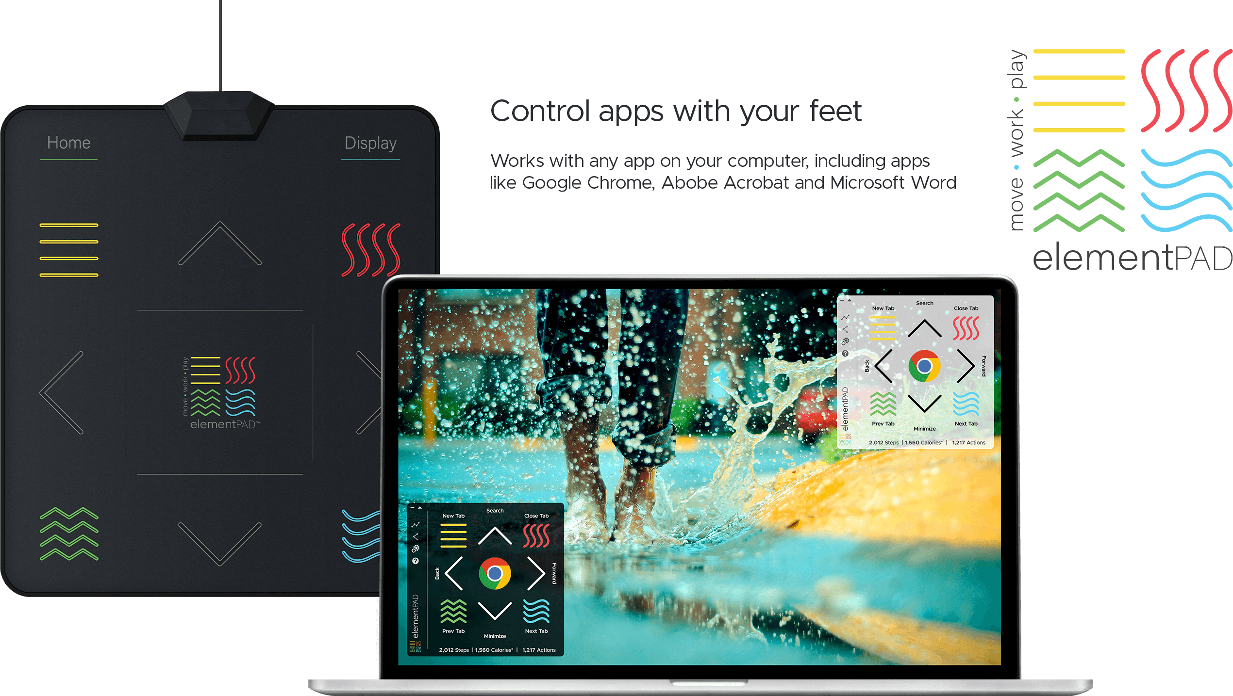
ElementPad is a movement-driven computing product that combines a physical standing pad with a customizable HUD interface. Co-founded by Tristan Pittard, the project spanned hardware and software design, including product strategy, UX research, and interaction flows. A key focus was building a HUD design system, a framework of reusable components, themes, and interaction patterns that allowed the interface to scale across formats (Full, Mini, and Stats) while staying accessible, consistent, and adaptable.
The Challenge
The core challenge: Create a unified design system for an unprecedented hardware–software ecosystem that could:
- Scale seamlessly across hardware and software interfaces
- Adapt to different space and visibility needs
- Maintain usability in Light and Dark modes
Clearly indicate which application was “in focus”
System Architecture
The ElementPad HUD was built as a component-driven system with three distinct interface formats:
- Full: mimicked the physical pad layout, displaying all assigned buttons
- Mini: reduced footprint while keeping all active buttons visible
- Stats: ultra-thin strip for maximum screen space, hiding button tasks
Each format was powered by the same design standards and reusable components, ensuring consistency and scalability across modes.

Theming & Accessibility
- Fully supported Light and Dark modes for user preference and visual accessibility
- Dedicated application icon space provided clear context for which app was active
UI patterns and interaction states validated with engineers to support keyboard-free accessibility and cross-application consistency

Governance & Reuse
The system included:
- Shared button states, typography, and iconography
- Clear component rules for when to use Full vs. Mini vs. Stats layouts
- Collaboration artifacts that bridged design and engineering, ensuring efficient implementation and a cohesive user experience
Outcomes
- Enabled multiple UI modes without fragmenting the design language
- Improved flexibility for users: more visibility when needed, more space when preferred
- Demonstrated how system-level design thinking can scale from hardware to software, creating a cohesive ecosystem with wellness and accessibility at its core